
@abh12345 (@steemcommunity) is doing another one of his charts for us to use for self evaluation / improvement. I try and take advantage of it every time he does one of these chart. I find it to be very helpful and informative. It is open to all with a simple comment requesting the pie chart.
Link to post
@abh12345/some-pies-for-you-on-this-fresh-monday-morning
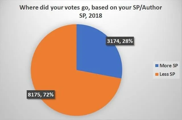
Here are my two charts for you to review 72% of my vote goes to Accounts that have less SP then I do. This is a good indication of where my support is directed. Let’s break it down further as the next chart will show.
Accounts with SP less the 500 SP receives 43% of my vote support.
501 - 5000 SP Minnow accounts receives 36% of my vote, support.
That’s a total of 79% of my support went to minnows and redfish in 2018.
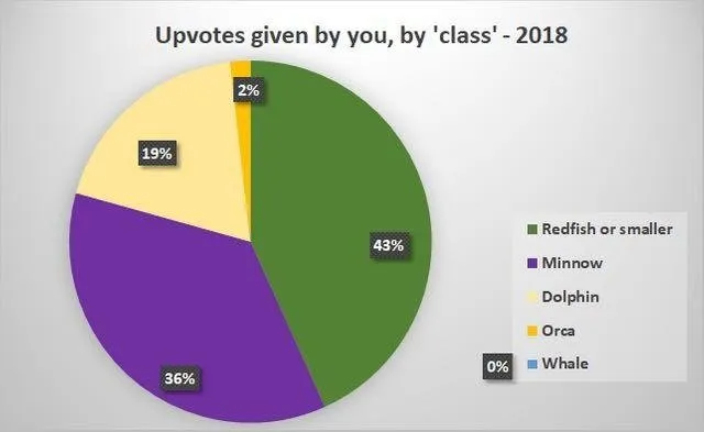
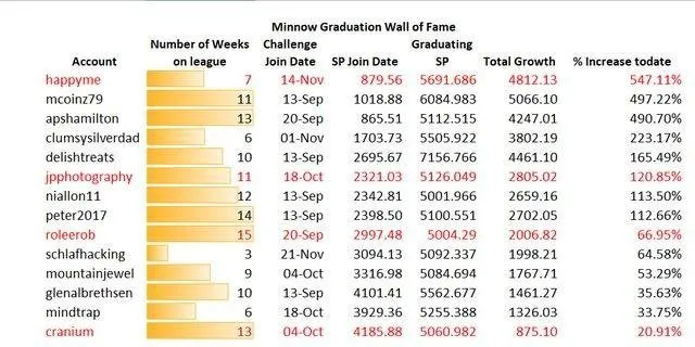
19% of my support went to Dolphins. That seems like a lot but not so much when you look at the chart below from @steemcommunity , @paulag . Over the last 15 weeks the number of minnows that moved into dolphin statues Is 14. That is only the people that I engage with not the total number of accounts that grew to Dolphin statues. As a result I engage with more Dolphins now more then 15 weeks ago.
@steemcommunity/4nvbt7-the-minnow-power-up-league-week-14
I have stated in the past that the single most important thing you can do here is build a foundation. The redfish / minnows of today will be the Dolphins and Orcas tomorrow . It takes time and investment in order to accomplish. Engaging with others, make freinds and share ideas. But most important, Have Fun and Enjoy the experiences.
Wolfhart
Super Red Wolf Moon
My freind @Priyanarc gave me the idea for this post.